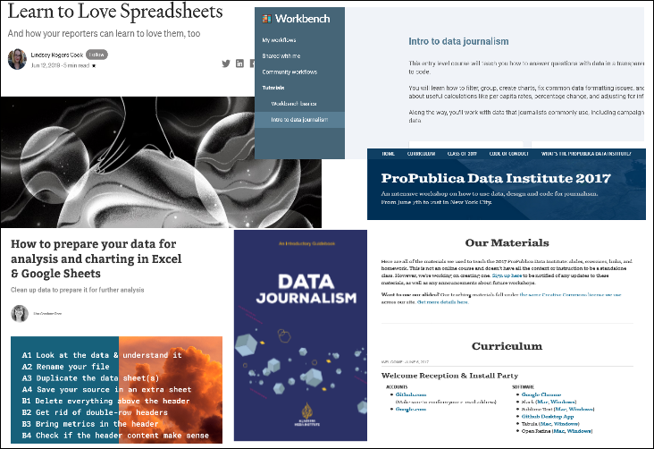
A good starting point for journalist looking for a practical introduction to handling data, is this package from the New York Times. It is made up of training material used for an in-house training programme, as explained in this post on NYT Open: How We Helped Our Reporters Learn to Love Spreadsheets. (Please note: paywall access restrictions may apply; but the material for download has been put up here on Google Drive and also GitHub.
“Based in Google Sheets, it starts with beginner skills like sorting, searching and filtering; progresses to pivot tables; and ends with advanced data cleaning skills such as if and then statements and vlookup. Along the way, we discuss data-friendly story structures, data ethics and how to bulletproof data stories,” the post says. The material includes training information, cheat sheets and tip sheets; including tips on editing data stories and a brainstorming guide. And it is not just about data, as this title indicates: ‘How to Organize Your Life With Spreadsheets’!
Workbench offers an an “entry level course will teach you how to answer questions with data in a transparent and reproducible manner, without the need to code.” Their platform has a hands-on and web-based interface - a learner does not require external tools to do the course, which teachers “how to filter, group, create charts, fix common data formatting issues, and combine different data sets.”
Though it dates back to 2012, some chapters in The Data Journalism Handbook 1, put together by the European Journalism Centre, like Become Data Literate in 3 Simple Steps, Basic Steps in Working with Data and Using Data Visualization to Find Insights in Data are useful. This chapter gives a graphic overview of the book contents. There is a version 2 of the handbook, which has been touched upon elsewhere on this site.
This ‘introductory guidebook’ (pdf) from the AlJazeera Media Institute covers the basics of data journalism. It is a slim booklet that deals with concepts and the workflow rather than methodology.
To learn about data preparation and cleaning exercise try How to prepare your data for analysis and charting in Excel & Google Sheets by the online chart creation and visualisation tool Datawrapper. Together with What Questions to Ask When Creating Charts you can get started with exploring different aspects of chart creation. The blog contains a lot of other tutorials and tips on a range of topics related to data visualisation; Datawrapper offers a free account, which can be used to access the tool and publish your charts. It goes without saying that you will need an online platform to do so. (Disclaimer: I am not associated with Datawrapper.)
ProPublica has a page with slides, exercises, links and homework to workshop in conducted in 2017 on “how to use data, design and code for journalism.” “This is not an online course and doesn’t have all the context or instruction to be a standalone class.” But, it provides an overview the skillsets required - from spreadsheets, data cleaning and evaluation and an introduction to code (HTML, CSS and JavaScript).
A Beginner’s Guide to Data Journalism: Let’s Build a Story From Scratch from freeCodeCamp focuses on one data set and walks you through the process of making a visualisation based on it. If you are looking for something relatively simple to start with, this is it.
Created: April 14, 2021; updated: May 9, 2021.